
Infographics can help your audience to interpret findings, gain context and recognise the importance of your research. Culture Counts’ Data Scientist, Tom McKenzie, explores the benefits of using data visualisation to help tell your story.
At Culture Counts we think a lot about generating “insights” – useful learnings from data that you can lean on to be more confident in decision making and enacting change at your organisation. You may choose to evaluate for any number of reasons. The motivating factor could be that data is required as part of an acquittal process. It could be that you want to demonstrate the importance of your work. Or you might be wanting to gather feedback that can help you make changes or improvements. Whatever the reason, having a clear understanding of why you are evaluating, and making that reason the central focus at each step of the evaluation process, will put you in the best position to discover and report on rich and impactful insights from the collected data.
In this blog we’ll focus on the second half of the Six-Step Evaluation Process: reporting results in context to enable change. Specifically, we’ll discuss how to leverage “narratives” to more effectively elicit the “a-ha” moment of understanding and clarity from your audience.
Why we need narratives
Humans are captivated by effective storytelling as a means of learning, establishing communication, and a way to foster a rich and enjoyable society. In fact, I would go so far as to say we need storytelling to most effectively grow, adapt, and learn. We can use this instinct to our advantage in our reporting by providing a clear and instructive narrative. Studies have shown that this can actually dramatically increase retention of the information presented, as well as improving the clarity of understanding. (Dykes, 2016)
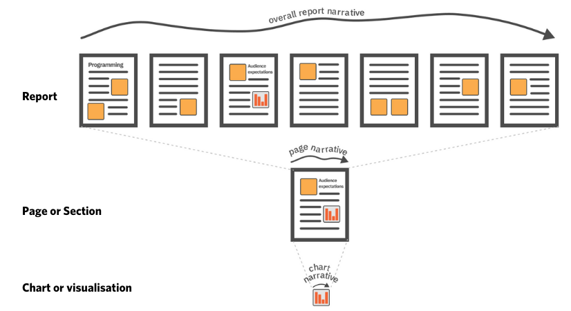
If our reports are a hierarchy of individual charts or visualisations, pages or sections, and the entire report, we can apply narrative at each level.
For example, an individual bar chart might be used to tell the story of how audience numbers have increased in the last quarter. This might sit in a section that details what expectations were for audience numbers and how it compares with what the data is showing, while the overall report might be looking at how changes in programming have impacted audience numbers across a range of different venues. See how each component has its own narrative or specific purpose, but they fit together into an overarching story.
By presenting our data through a lens of storytelling we can lead the reader through the report, helpfully pointing out famous landmarks and providing interesting anecdotes along the way. If your collected data is a vast and intimidating city, you, the report creator, are the tour guide saying things like “that over there is the house where Mozart was born”, and, “this is actually the steepest street in the Southern Hemisphere”.
Use narrative to shape the “so what?”
Wrapping your data in context is key to an engaging narrative. Where the data came from, how it was collected, why it’s relevant, and what you did with it are all essential pieces of context. They provide a strong foundation from which your audience can quickly grasp what is often called the “so what?” (Nussbaumer Knafflic, 2017) – the key message, takeaway, or “insight” that leads to productive and informed decision making. Remember that data very seldom speaks for itself; context is required to ensure we are correctly understanding what the data is trying to tell us. As renowned data visualisation expert Stephen Few said, “Numbers have an important story to tell. They rely on you to give them a clear and convincing voice.” (Dykes, 2016).
Focus for maximum impact
One of the most common mistakes we see is people trying to put too much information into a single chart or visual – look at all this data I’ve collected! This detracts from the main purpose (the “so what?”) of the chart and leaves the audience feeling confused, unsure, and just not very engaged or excited about what the data is trying to show them.
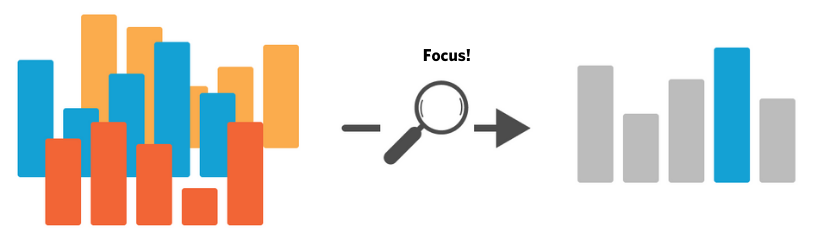
Focus the chart or visual to lead the viewer to the key message or “so what?”.
To get the most out of your reporting, break your data up into digestible chunks. Often individual charts or graphics that can be understood in less than 20 seconds will work best. Keeping the message concise and simple is a quick way to majorly upgrade a chart or report. This might emerge naturally during the report creation process; much like the role editing plays when fine-tuning written documents, we must constantly revise our charts and visuals with “is the takeaway message immediately clear?” at the front of our minds. If you yourself are unsure or confused at what a chart is saying, then your audience almost certainly will be too!
Creating a narrative-driven report in three steps
So if we are to sum up the above thoughts into what we’ll call “the process” of creating effective, narrative-driven charts, visuals, and reports, it might look something like this:
Step 1: Evaluate with a purpose
Why are you collecting data in the first place? Do you want to grow or adapt based on what you find in the data? In that case, make sure you are asking the right questions (in the right format!) so that analysing the data and creating compelling visuals will be a breeze.
Step 2: Craft a narrative
Having got your data you might have noticed some interesting features that you think should be highlighted. Or maybe your data is showing you that, as you expected, you’re on the right track and no changes are necessary. Both of these can be shaped into narratives, which, reported through this lens, will have maximum impact on the message getting through to your audience. However, remember that every visualisation should be based on what the data says – not what you want it to say. (Stikeleather, 2013)
Step 3: Report with confidence
So now you have your data and you know what story you want to tell. Great! Now you get to tell it. The narrative you choose will inform which visuals or graphics will be most effective (which will be the subject of a future blog post). Then, whether in a slide deck presentation to key stakeholders, a talk at a conference, or in a written document, you can lead your audience through the journey with confidence, pointing out the houses of any famous composers along the way.
Conclusion
That’s it for now! We’ll dive into the specifics of how narratives can determine what charting options we use and how to best compile them into an overarching story in a future post. Thanks for reading.
References:
Nussbaumer Knaflic, C. 2017. ‘so what?’. Storytelling with Data. Accessed 1 March 2021. http://www.storytellingwithdata.com/blog/2017/3/22/so-what
Dykes B. 2016. ‘Data Storytelling: The Essential Data Science Skill Everyone Needs’. Forbes. Accessed 1 March 2021. https://www.forbes.com/sites/brentdykes/2016/03/31/data-storytelling-the-essential-data-science-skill-everyone-needs/
Stikeleather, J. 2013. ‘How to Tell a Story with Data’. Harvard Business Review. Accessed 1 March 2021. https://hbr.org/2013/04/how-to-tell-a-story-with-data
Culture Counts provides evaluation solutions for measuring impact. Are you interested in our data analysis and reporting solutions? Contact the Client Management team for a friendly chat.