What are you trying to learn from your data? In this series, Culture Counts’ Data Scientist, Tom McKenzie shares how applying the ‘so, what?’ principle can help guide you to creating meaningful chart designs.
This practical how-to demonstrates some common chart types and why they are useful for answering different questions and highlighting different insights. First up: charts for displaying how data is distributed.
The ‘so, what?’ principle
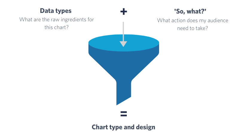
The ‘so, what?’ is what you are actually hoping to get out of a report, piece of analysis, or collection of data and can usually be structured into a hierarchy of increasing specificity. You can read more about the ‘so, what?’ principle here.
Creating an effective chart involves a lot of choices and decisions – which chart type should I use? How should the categories be ordered? Would colour increase the readability? The ‘so, what?’ principle can be used to guide you through this process to (hopefully!) end up with a chart that is fit for purpose.
In this post we will look at one aspect of data that is a very common starting point for any analysis, that is: “what does my data actually look like?”
Applying the ‘so, what?’
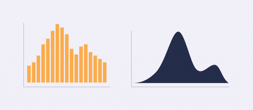
When collecting numerical data, such as the amount spent at an event (in $) or a respondents age, the first way we should look at this data is to look at the distribution of values. There are many different chart types for visualising distributions each with slightly different strengths. Some of our favourites are shown in the figure below.
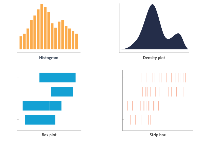
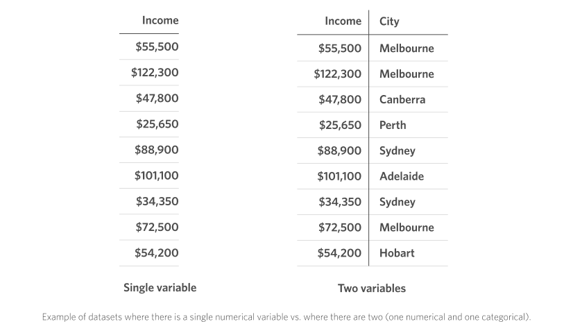
These four charts can be further divided in terms of the number of variables they are displaying. The top two (histograms and density plots) show data from only a single variable, while the bottom two (box plot and strip plot) are for displaying two variables, one of them being a numerical value (this is the variable whose “distribution” we are interested in) and the other being a categorical variable (which is plotted on the vertical axis in the figure). For example, consider the example data shown below in a typical spreadsheet format. On the left, we have only the numerical data, which we could visualise using a histogram or density plot. On the right, we have two variables – one numerical and one categorical – for which we might choose instead to visualise using a box plot or strip plot to get information about the distribution of incomes for respondents from each city in the dataset.
Let’s go a bit deeper into each of these chart types and discuss the reasons when and why you would want to choose each one.
The Workhorse: Histogram
Histograms are one of the oldest and still most frequently used chart types. They are the go-to choice for any data analyst looking to know more about the data they are working with, as they provide a flexible and customisable way of looking at the raw values.
A histogram displays the count, or frequency, of values for a series of sequential “bins”. Each bar in a histogram represents one bin, with its height being proportional to the count. The power of histograms comes from being able to tune the size of this “bin” so that we can go from a very detailed, fine-grained view of the distribution for small bin sizes, up to a more general and broad view for large bin sizes.
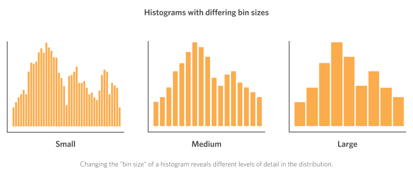
As a concrete example of the “bin” concept, let’s say we have our collection of data about the income of each respondent in a dataset. A small bin size for displaying this data in a histogram might be increments of $500. So the first bar on the left hand side of the histogram would be the count of all respondents whose income was in the $0 – $500 range, while the second bar would be the count for those in the $500 – $1000 range, and so on. Conversely, a large bin size for this data might be $10,000 increments. In this case (for reference, looking at the “large” bin size histogram in the figure) the first bar would be the count of values in the $0 – $10,000 range, with the second bar representing those in the $10,000 – $20,000 range.
When to choose a histogram
- Have collected a set of numerical data
- Want investigate how the values are distributed in detail
Strengths of histograms
- Tune the “bin size” to get different levels of detail
- Can quickly identify potential outliers in the data
- Widely used chart type – relatively familiar to most viewers
The Smooth Operator: Density Plot
Density plots look pretty cool, all smooth lines and shaded area! The way that density plot are constructed is outside of the scope of this blog post, but just know that they are a close cousin of the histogram.

Like the histogram the range of the variable you are investigating is on the x-axis, while the height represents the relative frequency at each value in this range. Also similar to the histogram, density plots have a parameter that can be used to tune how fine-grained the level of detail, or “smoothing”, in the density plot is, this is called the “bandwidth”.
I like density plots because they strip away a lot of the distractions of other chart types, allowing you to quickly get a “feel” for how your data is distributed, including identifying the modality (how many peaks there are) and spread (how wide or narrow the range of values are). They can also add some “chart variety” to your reports or presentations so that the audience isn’t looking at page after page of bars and columns.
When to choose a density plot
- Have collected a set of numerical data
- Want to get a quick “feel” for how values are distributed
Strengths of density plots
- Can quickly identify the modality (number of peaks)
- Tune the “bandwidth” to get different levels of detail
- Adds chart variety to a report or presentation
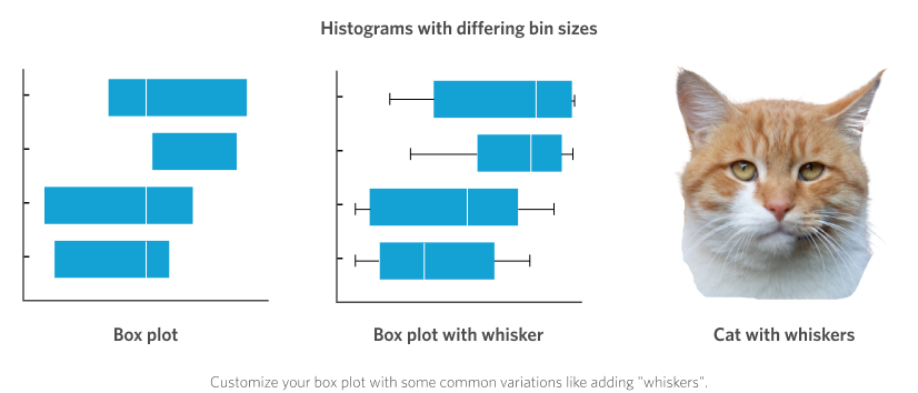
The Classic: Box Plot
The box plot needs no introduction! Although unfortunately, often they do. What do I mean by this you ask? Well, box plots are great and used frequently, so I’m sure we have all seen at least a few in our lives. But their ability to stealthily encode a significant amount of data means they also sometimes need accompanying explanation. Luckily over time standards have emerged, and so a simple box plot may now be reasonably assumed to have the following features:
- Box lower bound = 25th percentile
- Box upper bound = 75th percentile
- Mark on box = median
On top of this each box can have a set of accompanying “whiskers” extending out either end. These often extend out to the minimum and maximum values in the dataset, or sometimes to 1.5 x the interquartile range (I warned you it might need some explaining!).
We tend to keep things simple and only show the central “box”. Although now reduced to only a few numbers instead of visualising the raw values (as we did with the histogram and density plots), the box plot still conveys a good sense of the “spread” of the distribution by visualising the “middle 50% of values” (which is what the range between the 25th and 75th percentiles is). This is often called the “interquartile range”, or IQR. Data with a wider IQR have a higher spread in their distribution than those with a narrow IQR. However, any potential modality (multiple peaks) will be obscured in a box plot.
When to choose a box plot
- Have collected a set of numerical data together with a categorical variable
- Want to get a quick idea of the “spread” of the data for each category
Strengths of box plots
- Can quickly compare the median and IQR for multiple categories
- Widely used chart type – relatively familiar to most viewers
- Customisable – add some whiskers!
The Barcode: Strip Plot
Lastly, the strip plot (also known as ‘barcode plots’ for obvious reasons) can be used when we want to split the data by a categorical variable, but we also want to show the raw values of the numerical variable.
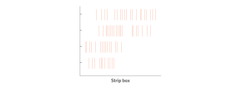
In a strip plot each “strip” (a thin vertical line) represents a value in the dataset placed along an x-axis scale that comprises the range of values of this variable. For example, the x-axis scale might go from $0 to $200,000 for our range of collected data on income. Say a value in this dataset is $47,800, we just go to $47,800 on the x-axis scale and add exactly one “strip” mark. Keep doing this for all the values in the dataset. When we add the y-axis to be the categorical variable it just takes one extra step: line up the “strip” mark with the category label so that the strips are grouped vertically.
This chart type is useful again for getting a quick “feel” for the data (as every individual response is shown in the chart), particularly when we want to look at the distributions for different groups (the categorical variable). However, because the strips can all lie over the top of each other (if their values are the same) it loses some of the detail of, for example, the histogram, where the frequency at each value is represented in the chart. Some common workarounds to this might be to make each strip mark slightly transparent so that you can see denser areas of colour/ink where the marks overlap with each other.
When to choose a strip plot
- Have collected a set of numerical data together with a categorical variable
- Want to display every single “raw” value in the dataset
Strengths of strip plots
- Can quickly identify potential outliers in the data
- Can identify groups or “clusters” of values in the data
- Adds chart variety to a report or presentation
That’s it for our guide to visualising the distribution of data following the principles of applying the ‘so, what?’. Next up in the series: Making comparisons.
Culture Counts provides evaluation solutions for measuring impact. Are you interested in our data analysis and reporting solutions? Contact the Client Management team for a friendly chat.