
What are you trying to learn from your data? In this series, Culture Counts’ Data Scientist, Tom McKenzie shares how applying the ‘so, what?’ principle can help guide you to creating meaningful chart designs.
This practical how-to demonstrates some common chart types and why they are useful for answering different questions and highlighting different insights. Previously, we talked about charts for displaying how data is distributed. In this post, we’ll look at what chart types work best for making comparisons.
Apply the ‘so what?: Comparative charts
Making comparisons is a key part of why data visualisations are so helpful in decision making.
Is spending at the market higher this year than it was last year? Are more of our audience from Austria or Sweden? However, it is our job as chart creators to ensure that the interpretation of these comparisons is straightforward, clear, and most importantly, accurate. If the reader can take away the correct message from just a quick glance then we have done our job well.
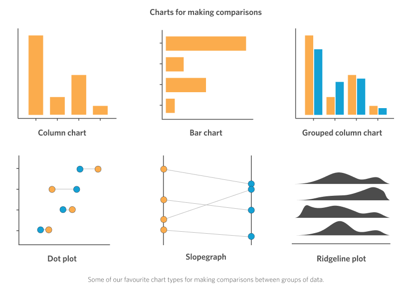
Below we’ll look at some common chart types for making comparisons between data, describing the strengths and potential pitfalls of each. As we described in the previous post on distribution charts, the choice between each of the below charts can be led by the combination of what type of data you have, and what the intended takeaway message is (the ‘so, what?’)!
Column and Bar Charts
Perhaps the most widespread of all chart types are the familiar bar and column charts, and for good reason! In the vast majority of cases these are the most efficient and effective way of conveying data per group or category so that comparisons can be made between the bars or columns. In many (but not all) cultures it is more natural to accurately gauge differences in “height” rather than the “length” of objects (some have attributed this to our history of gazing out across the horizon[1]), and so it can be argued that the vertically aligned column charts provide a slightly more effective mapping between the size of the columns and the values they represent. They also are most effective when the categories are ordinal (i.e. contain an inherent order; for example: age groups), or time based (for example: months of the year). This is such a common practice that showing time based categories anywhere other than along the horizontal axis can cause serious chart dissonance for the viewer.
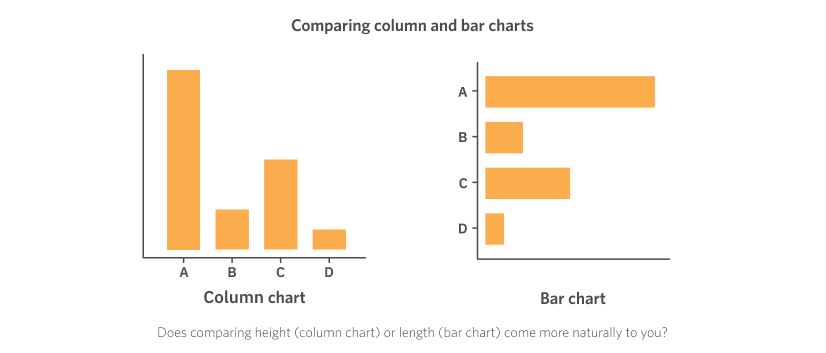
One major advantage that the bar chart has over the column chart, however, is the ability to handle longer category labels. In the above examples we’ve just used single letters for the categories, but in the real world the category names might more likely be things like “Social media”, “Newsletter distribution”, “Painted on the back of a truck”. These will be very hard to fit onto a column chart without resorting to things like angled text, multiple line wrapping, or even replacement with a letter and a separate lookup table to reference the actual category label. Try to avoid these style hacks wherever possible as it increases the mental (and physical – have you ever had to tilt your head to read a chart label?) burden on the reader. Anything that makes your chart harder to read lowers its impact and makes it less likely for the reader to take away the intended message
One key aspect to avoid allowing misleading comparisons is that because we are using the visual height or length of the bars to represent the values, these charts must always start at zero (there are some contexts where this may be loosened, but not many). Chopping off part of the bar is like chopping off some of the data, and even if the axes are labelled correctly or the break is indicated with a visual mark, it is dicey territory.
When to choose a bar/column chart
- Have a set of data that can be grouped into categories
- Want to make comparisons between those categories
Strengths of bar/column charts
- Intuitive and clear interpretation
- Widely used chart type – very familiar to most viewers
- Clean and simple design
Grouped Column and Bar Charts
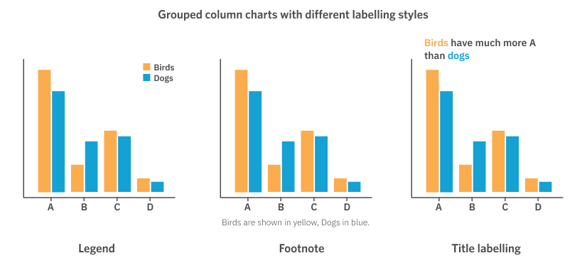
What if we have our categories, say A, B, C, and D, but now we want to add a second variable to make comparisons between, say Birds and Dogs. For this we can use what are called “grouped” bar or column charts. In these charts we still keep our main categories (A, B, C, and D) on the axis, but we split our bars (or columns) into two bars, one for each group. These are then usually denoted to be different by using a different colour, shade, or pattern, and labelled in a legend, footnote, or the title of the chart itself.
A few things to keep in mind about grouped bar and column charts: the whitespace between the groups should be bigger than the space between bars. Each group should generally have less than 5 or 6 categories, otherwise comparisons become far too difficult and the charts will look overwhelming; the strongest comparisons can be made when there are only 2 or 3 group categories. Lastly, grouped bar or column charts are best for making within-group comparisons and less suited to for making comparisons between the groups themselves – i.e. good for comparing the amount of A between Birds and Dogs, less so for comparing the overall amount of A verses C for Birds, for example.
When to choose a grouped bar/column chart
- Have a set of categories that can be split into different groups
- Want to make comparisons within the groups for each category
Strengths of grouped bar/column charts
- High density of information
- Widely used chart type – quite familiar to most viewers
- Use of extra colours adds some visual interest – but avoid too much!
Dot Plots and Slopegraphs
An underused chart type for comparisons, in my humble opinion, is the dot plot, or more specifically the ‘Cleveland dot plot’ (named after the data visualisation pioneer William Cleveland). Dot plots provide a great alternative to bar and column charts. With years of experiments and testing to back it up, Cleveland argues that “dot plots allow more accurate interpretation of the graph by readers by making the labels easier to read, reducing non-data ink (or graph clutter) and supporting table look-up.”[2]
Dot plots are most typically aligned with the categorical axis running vertically and the numerical values along the x-axis. They can be used as replacements for normal bar or column charts, with one dot per category (often placed along a grid line that acts to link the category label visually to the dot). They can also replace grouped bar or column charts, placing several (different coloured) dots along each gridline. This can reduce the visual real estate required for the chart compared with the grouped bar or column versions, but can also result in overlapping dots. As for the grouped bar/column version, these comparative versions work best with a small number of comparative dots – try to keep it to <5.
One aspect of the “grouped” dot plot that distinguishes it from its grouped bar or column analogue is that, particularly for binary comparisons, the dots can be linked with a line that helps give visual importance to the difference between the data points. In the figure below the gridlines have been made thinner and dotted, while the linking lines are solid black in order to emphasize this effect.
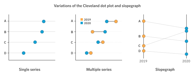
An interesting variation on the dot plot is the slopegraph. These are particularly suited to when the comparison is binary (i.e. between two groups) – perhaps something like the difference from the previous year to this year, as shown in the example above. The slopegraph uses a vertical numerical axis on which each dot is arranged according to their value on this axis. A line then connects the related dots (e.g. the ‘B’ dots) between the two vertical axes. This line puts the “slope” in “slopegraph”, as the angle of it can let us quickly gauge if a value has increased or decreased (sloping up or sloping down), and by approximately how much (the angle of the line), for each category.
When to choose a dot plot or slopegraph
- Have a set of categories that can be split into different groups
- Want to make comparisons within the groups for each category
- Have two primary groups you wish to compare (binary comparison)
Strengths of dot plots/slopegraphs
- Very high data to ink ratio – clean design
- Somewhat novel chart type – add visual interest
- Provides different points of emphasis from analogous bar or column charts (e.g. highlights the difference, or quickly shows the increase/decrease, etc)
Ridgeline Plots
In the last blog post in this series we introduced the density plot as a means of visualising data distributions. Now, what if we wanted to compare distributions for different categories? The most simple approach here would be to stack them on top of each other – and it is here that we get the “ridgeline” plot. These might look somewhat familiar to you from the iconic Joy Division album cover for their 1979 album Unknown Pleasures.[3] Although theirs is actually a stacked line chart, the visual effect is the same.

The reason the Joy Division cover visualisation was so effective (scientifically) was because it was highlighting a recurring, cyclical pattern (the signal from a pulsar). Ridgeline plots are excellent candidates whenever we have these data types – i.e. ordinal (ordered) categories, because they allow us to follow the shape of the data in a sequence. In the figure below this is demonstrated with a common example of ridgelines: weather patterns by month of the year. The bar or column chart of this example might be just the average temperature per month, and while this would also show the effect of the seasons changing in a cyclical nature the ridgeline plot provides a denser view of the data by showing the distribution of daily average temperatures for each month.
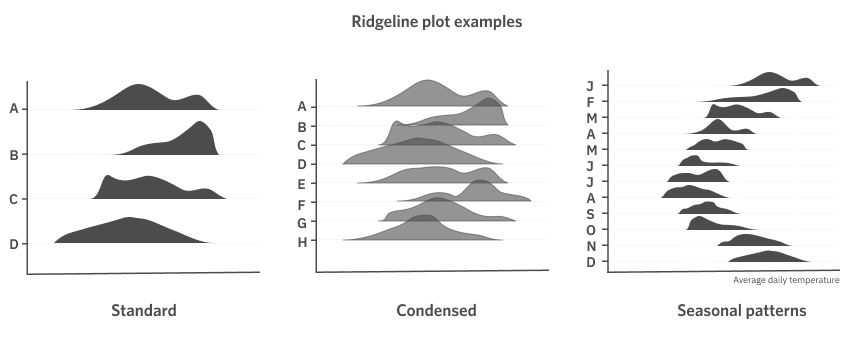
When to choose a ridgeline plot
- Have a set of categories that can be split into different groups
- Want to compare the distribution of data in each category
Strengths of ridgeline plots
- Strong visual image
- Novel chart type – add visual interest
- Excellent at highlighting cyclical, seasonal, or just ordinal (ordered) patterns
That’s it for our guide to making comparisons in data visualisations following the principles of applying the ‘so, what?’. Next up in the series: parts-to-whole relationships.
References:
[1] Andrews. R.J. ‘Info We Trust’ (pp 68), Wiley.
[2] ‘Dot plot (statistics)’. Accessed 10 June 2021. https://en.wikipedia.org/wiki/Dot_plot_(statistics)
[3] The actual visualisation has a fascinating history too; if you’re interested see the article in Scientific American: https://blogs.scientificamerican.com/sa-visual/pop-culture-pulsar-origin-story-of-joy-division-s-unknown-pleasures-album-cover-video/