Evaluation Highlights
PUBLIC OUTCOMES
Contents
Evaluating an example event
Example Event
The organisation engaged Culture Counts to conduct an evaluation of the event, which took place on 26 January 2020.
Data Collection
In total, 151 members of the public were surveyed via intercept surveys at the event on 26 January 2020. Following the event, participants were invited to respond to a survey via email, 204 participant responses were received for the email survey.
Strategic Alignment and Dimensions
Each survey contained nine ‘dimension’ questions, asking the public about their experience of the event. These dimensions have been developed with the cultural sector to measure the impact, quality and value of arts and cultural events and were chosen based on their alignment with the organisation's strategic objectives.
Public and Participants Assessment
| Outcome | Dimension | Statement |
|---|---|---|
|
Cultural Outcomes |
Meaning | It moved and inspired me |
|
Social Outcomes |
Access | It gave me the opportunity to access activities I would not have otherwise access to |
| Safe | It made me feel safe and welcome | |
| Connection | It helped me to feel connected to people in the community | |
| Economic Outcomes | Enthusiasm | I would take part in something like this again |
|
Place Outcomes |
Place | It made me feel proud of my local area |
| Growth | It could appeal to new audiences | |
|
Quality Outcomes |
Local Impact | It's important that it's happening here |
| Rigour | It was well thought through and put together |
Dimensions are assessed using a Likert scale, in which respondents move a slider to a point to indicate whether they agree or disagree with the dimension statement.
Who completed the survey?
Survey respondents were asked to provide their gender, age, identity and postcode as part of the survey. This enables data to be matched to the wider population and responses to be filtered to understand differences in demographics.
The charts show the proportion of survey responses captured for each of the gender, age and identity demographics for attendees of the cultural event, alongside the top postcodes entered by respondents and their location origin.
GENDER
AGE

REGION

IDENTITY
Insights
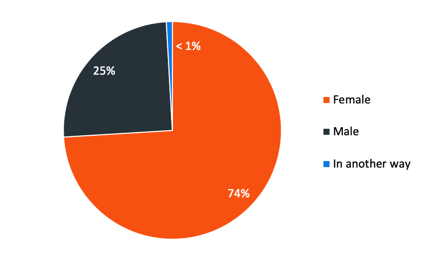
Almost three quarters of survey respondents were female (74%), with males making up 25% of the sample and less than 1% identifying their gender in another way. All age groups were represented in the sample, the largest cohort sat within the 60 years old and over age bracket (30%), followed by those aged between 50 to 59 (18%).
The majority of respondents came from the Perth Metro Area (77%), with an additional 14% specifically from the City of Perth.
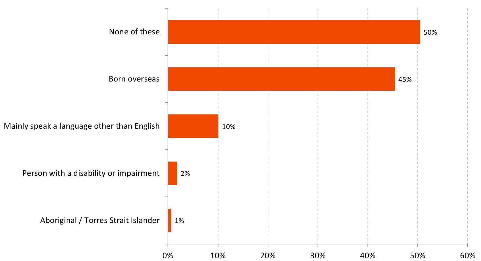
Almost half (45%) of the respondents indicated that they were born overseas. 10% mainly spoke a language other than English, 2% were living with a disability or impairment, and 1% were of Aboriginal or Torres Strait Islander background.
What did the public think of this cultural event?
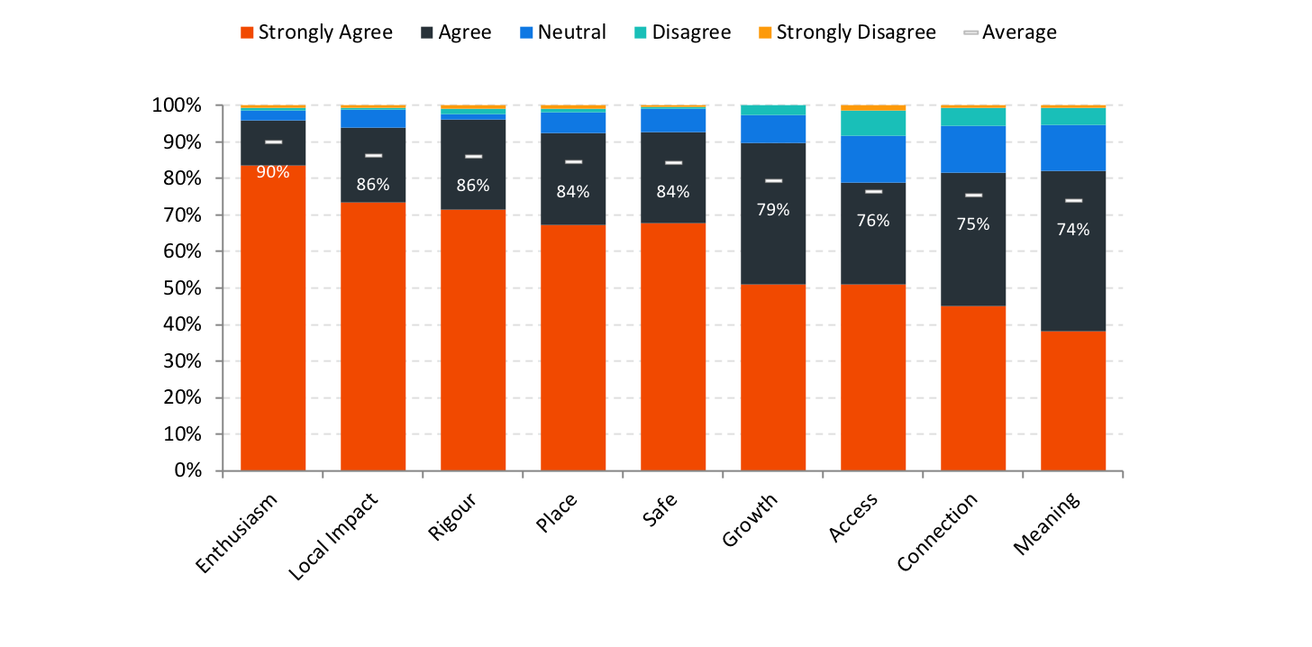
Survey respondents moved a 101-point continuous slider to indicate whether they agreed or disagreed with the dimension statements using a Likert scale. The chart contains data for all public responses, showing the average result and the percentage of people that agreed or disagreed with each of the statements.
Insights
Five of the nine dimensions measured received an average result of over 80%.
‘Enthusiasm’ reported most highly at 90% average agreeance, followed by ‘Local Impact’ (86%) and 'Rigour' (86%). These results indicate that respondents were most likely to agree or strongly agree that it was well thought through and put together, that it was important it was happening here and that they would come to something like this cultural event again.
Was the survey sample representative of the audience population?
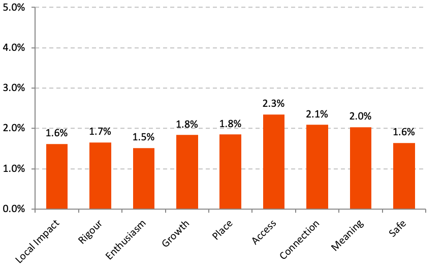
The Culture Counts digital platform aims to capture survey responses via various methods at minimal marginal cost. Achieving larger samples enables organisations to be confident that the average result and opinions of the survey group are representative of the total audience. This chart shows the margin for error for each dimension from the sample.
Insights
At a 95% confidence level, the margin of error for dimensions ranged from 1.5% to 2.3%. This means that we can be 95% confident that if we surveyed the entire visitor population the average outcome for 'Safe' would fall within 1.86% of the average generated by the sample.
Does gender or age influence public perceptions?
Every respondent to the survey was asked to identify their gender and age as part of the survey. This information enables perceptions to be filtered by demographics and helps organisers understand whether outcomes are different based on these attributes.
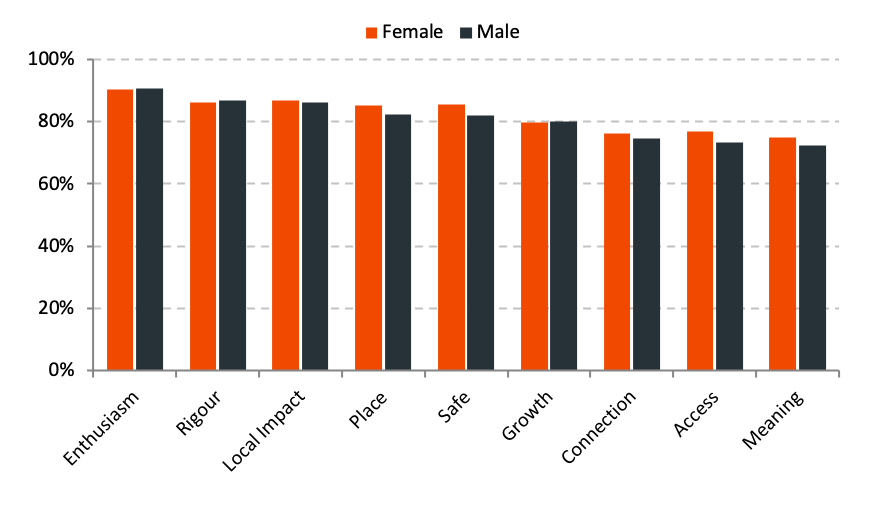
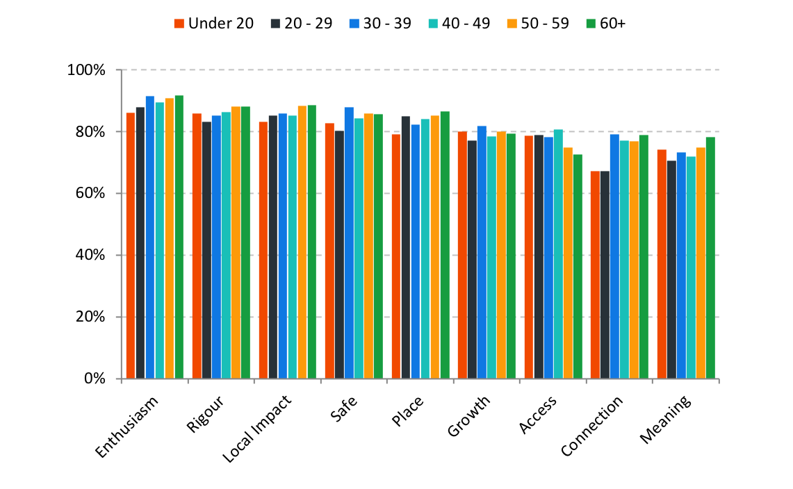
The below charts show the dimension results for each of the dimensions based on gender or age group.
DIMENSION RESULTS BY GENDER
Insights
Overall, dimension averages from female and male respondents were fairly similar. The largest difference was seen in the results for ‘Safety', 'Place' and 'Access'. Females were slightly more likely to agree that the event made them feel proud of their local area, gave them the opportunity to access activities they would otherwise not have access to and the event made them feel safe and welcome. Males were more likely to agree that the event was well thought through and put together.
DIMENSION RESULTS BY AGE
Insights
Generally, respondents aged between 30-39, 50-59 and 60 plus, were most positive for their responses to the dimension questions otherwise results were fairly similar.
Who has attended before?
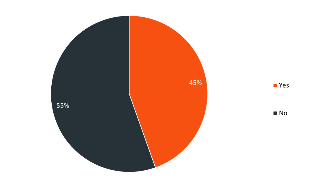
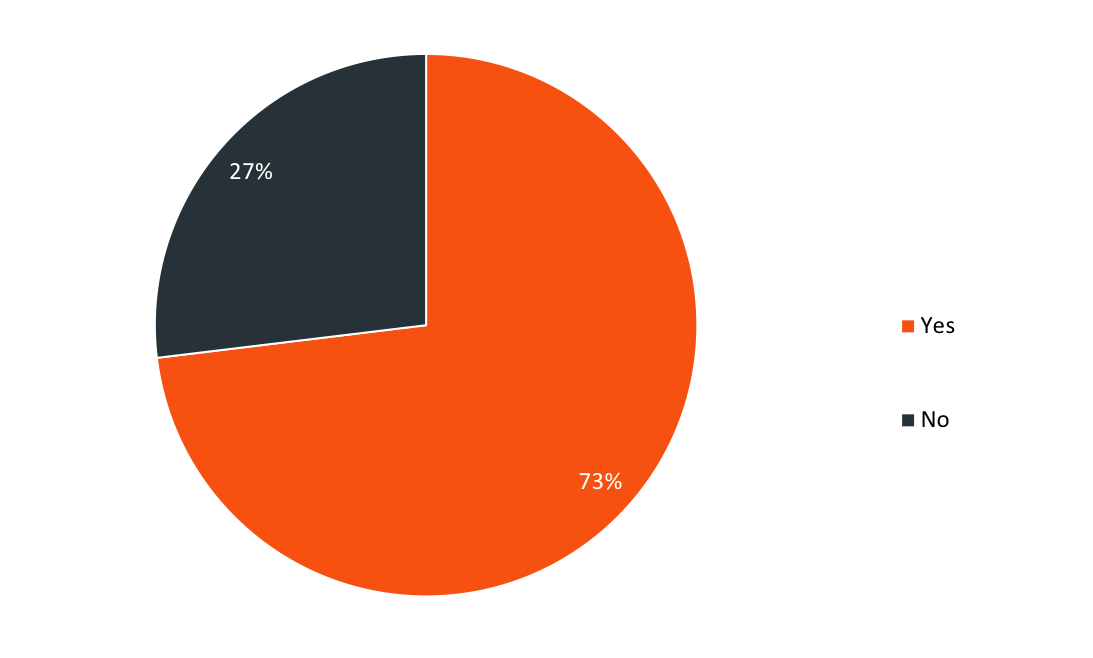
All public respondents were asked whether they had attended the cultural event in the past. They were also asked if they had ever attended an event by this organisation before. The pie graphs below display the collected results.
Is this your first time attending the example event?
Is this your first time attending an event by this organisation?
Insights
Over half (55%) of those surveyed were a new audience for the cultural event, indicating that this was their first time attending the event. A large proportion of respondents were loyal attendees of the event, with 45% indicating that they attended the event previously.
Of those first time attendees, almost three quarters (73%) hadn't been to an event by the organisation, demonstrating the cultural event's success in drawing new audiences.
How did the public rate their experience overall?
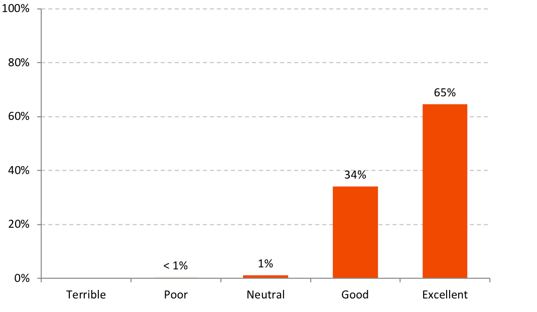
As part of the survey, attendees were asked to rate their experience overall selecting one option from a dropdown menu - Excellent, Good, Neutral, Poor, and Terrible. This chart shows the percentage of respondents that rated the event within these five options.
Insights
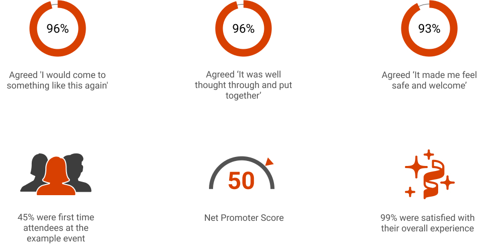
When asked how they'd rate their overall experience of the cultural event, 99% of public respondents indicated that they'd had a positive experience - with 65% having an 'excellent' experience.
Would the public recommend this cultural event?
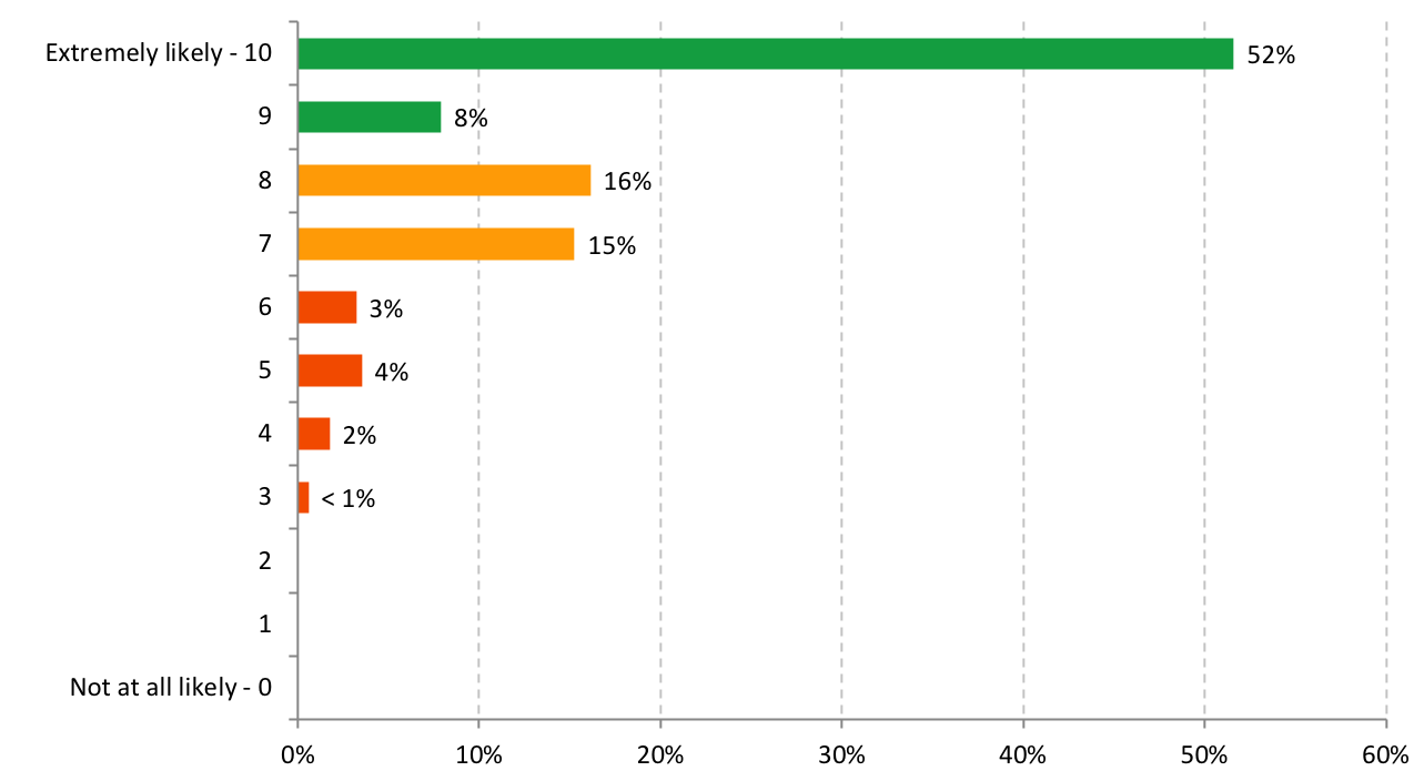
Respondents were asked whether they would recommend this cultural event to a friend or colleague. Respondents could choose a number from 0 to 10 from a pulldown menu, with 0 meaning not likely at all, and 10 meaning extremely likely.
These scores can be used to calculate a Net Promoter Score (NPS). NPS measures loyalty between the organisation and its audience. People giving a score of 9 or 10 are considered Promoters. Detractors are those who respond with a score of 0 to 6. Scores of 7 and 8 are Passives.
NPS is calculated by subtracting the percentage of respondents who are Detractors from the percentage of customers who are Promoters.
This chart shows the proportion of respondents that would or would not recommend this cultural event, followed by the calculated NPS below.
Insights
60% of Public respondents responded to the NPS question with a 9 or 10, classifying this group as Promoters, 31% of respondents were Passive (score of 7 or 8) and the remaining 9% are considered Detractors (scoring between 0-6).
An NPS can range between -100 and 100. A score that is positive (i.e. higher than zero) is felt to be good. This event's NPS of 50 is a highly positive response, and shows a result that will eventuate in attendee loyalty and the likelihood of recommendations to future events.
Public Comments
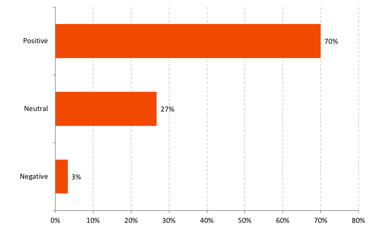
Respondents were also asked to leave any additional feedback about the event. All feedback has been classified into positive, neutral or negative categories and this breakdown has been included.
A selection of comments has been highlighted below.
Attendance
The cultural event was hosted at a large park in the heart of the Perth CBD. The following table shows the attendance across the event period. Attendance figures were provided by the event organisers.
The estimated total attendance was 15,750, with a ratio of around 0.5 children to adults on average found from sampling. The breakdown of adults and children is shown below.
ATTENDANCE DATA
| BREAKDOWN | ATTENDANCE |
| Adult Attendance | 10,500 |
| Children Multiplier | 0.5 |
| Children Attendees | 5,250 |
| Total Attendance | 15,750 |
Economic Impact Analysis
Survey respondents were asked to estimate how much they had spent at the event, on accommodation, as well as indicate what they would have done had they not attended. Combining this data with attendance figures allows an overall impact figure to be generated.
To calculate the impact to the Perth CBD, only additional visitation attributed to the event is included. Of those, only expenditure that would not have otherwise occurred is considered. In this case, the economic impact is from attendees who would have otherwise stayed at home, gone to work, or those who would have done something else outside the CBD.
The tables below detail a breakdown of visitation by additionality (i.e. visits that were additional because of the event), visitor expenditure (if they came and stayed in the area because of the event and other spending they did), and total economic output. Respondents were asked to estimate the average total expenditure for their party so that spending on behalf of children could be accounted for.
For the purpose of this assessment, the children ratio multiplier, was removed from the total attendance figure.
EVENT IMPACT
| ORIGIN | ATTENDEES | EVENT SPEND | ADDITIONALITY | TOTAL |
| City of Perth | 1,303 | $34.14 | 65% | $28,787 |
| Perth Metro Area | 8,080 | $19.71 | 80% | $126,684 |
| Elsewhere in WA | 670 | $42.55 | 88% | $25,160 |
| Interstate | 186 | $28.00 | 100% | $5,213 |
| Overseas | 261 | $68.57 | 71% | $12,766 |
| $198,609 |
ACCOMMODATION & TRIP SPEND
| ORIGIN | NIGHTS STAYED IN THE AREA | ACCOMM SPEND | AVG ADDITIONAL TRIP SPEND/NIGHT | ADDITIONALITY | TOTAL |
| City of Perth | 604 | $48.75 | $- | 65% | $19,043 |
| Perth Metro Area | 673 | $63.00 | $- | 80% | $33,738 |
| Elsewhere in WA | 652 | $123.33 | $45.00 | 55% | $59,961 |
| Interstate | 745 | $58.33 | $82.17 | 50% | $52,314 |
| Overseas | 2482 | $71.00 | $77.70 | 11% | $39,987 |
| $205,043 |
ECONOMIC IMPACT SUMMARY
| DIRECT IMPACT | |
| Total Nights Generated | 1,924 |
| Attendee Spending | $403,652 |
| Event | $198,609 |
| Accommodation | $137,525 |
| Trip | $67,518 |
| Organiser Expenditure | $500,000 |
| Total Direct Impact | $903,652 |
| Total Multiplied Impact | $2,623,229 |
Event expenditure scaled by an output multiplier of 2.96, the national Food and Beverage multiplier (2.96).
Accommodation expenditure scaled by an output multiplier of 2.75, the national Accommodation multiplier.
Trip expenditure scaled by an output multiplier of 2.92, representing an average of national Retail output multiplier and Food and Beverage output multiplier (2.88 and 2.96 respectively).
Organisation expenditure scaled by an output multiplier of 2.92, an average of the the Australian national Rental and Hiring Services output multiplier (3.17) and the the Australian national Heritage, Creative and Performing Arts output multiplier (2.67).