The right chart can work wonders for a report, revealing new information, neatly summarising your data, and helping support your conclusions (not to mention breaking up pages of boring text). So how can you work out which chart to use?
Start by asking yourself what you’re actually trying to show. What type of data do you have (categorical, numerical, and so forth)? Do you have more than one variable? Are you trying to show a relationship between your variables? Do you need to show how data is distributed, or just an average? Are you showing change over time? Your choice of chart should add value – in other words, if the chart is no better than a data table at clearly illustrating your point then you probably need to go back to the drawing board.
Let’s take a look at some of the most common charts we use here at Culture Counts, and when you should (and shouldn’t) use them.
Horizontal Bar Chart
The bar chart is one of the most common charts we use in our reports here at Culture Counts – it’s the unsung hero that just gets the job done without showing off.
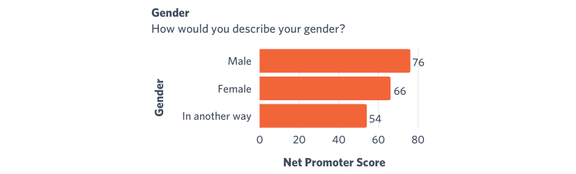
Bar charts are a great way of comparing the values of different categories and are excellent at showing how different categories rank compared to each other, either in absolute terms (for example, dollars) or proportion (percentage). By ordering the chart from largest category to smallest, you are immediately highlighting the most important aspects (because people start reading from the top of the chart). Make sure you start your axis from 0 to avoid making differences appear more extreme than they are.
Column Chart
The close cousin of the horizontal bar chart is the column chart.
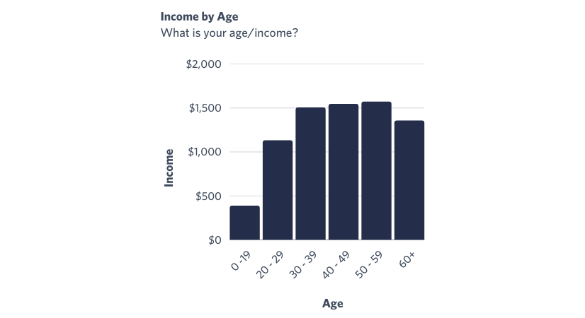
We tend to use column charts with ordinal categorical data – in other words, where there’s a clear order that categories should go in (e.g. year, age, the amount spent, level of agreement). This is because the visualisation displays correlation rather than a ranking, for example that an increase in age is correlated with a higher income. If your categorical data is nominal and doesn’t have an inherent order (e.g. favourite colour, gender), then you should consider using a horizontal bar chart.
Pie Chart
You’re probably already familiar with pie charts. If you’re not, you’re at least familiar with pie, right? Cool, so now imagine a pie in chart form. That’s a pie chart.

Pie charts are used to show relative proportions of different data segments. According to statistician and data visualisation pioneer, Edward Tufte, “the only thing worse than a pie chart is several of them… given their low data-density and failure to order numbers along a visual dimension, pie charts should never be used.” [1] Yeah, pie chart haters gonna pie chart hate. So besides being the pineapple on pizza of the chart world, what are pie charts good for and when should you use them?
Pie charts primarily get used because (a) they’re pretty much universally understood, (b) they make it clear that the different segments add up to 100% of the data, and (c) they look pretty. I’d recommend limiting their use to when there are only two or three “slices” to compare (anything more starts to get really messy), and to use them sparingly. At Culture Counts, we mainly use them to visualise responses to yes/no questions and to give breakdowns of gender. For more complicated analysis (such as showing results of a five-point Likert scale) we tend to use a stacked bar chart.
[1] The Visual Display of Quantitative Information, pg. 178
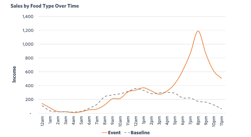
Line Chart
Line charts are an excellent way of showing how data changes over time.
You could use a column chart to display the same information, but the primary advantage of a line chart is that it is much easier to read when comparing multiple categories, whereas a column chart can devolve into a bit of a hot mess. Consider the following two charts:
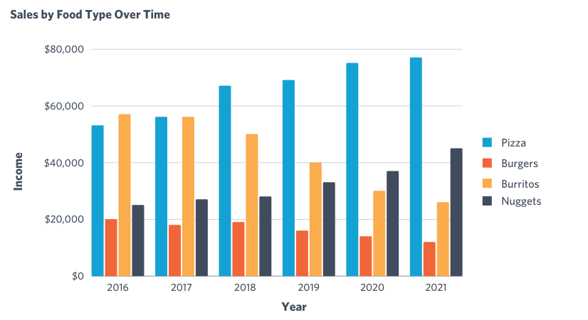
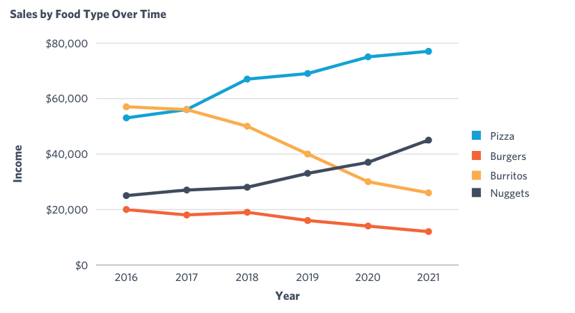
There’s nothing to say that you can’t use a column chart here, but it’s also pretty clear that it’s easier to see overall trends on the line chart.
Culture Counts mainly uses line charts to show event visitation over time, with one line representing the event and the other representing a baseline of some variety. Line charts are very well suited to such temporal data – i.e. values changing over time.
Boxplot Chart
Sometimes you don’t just want to show the “average” value of some data, you also want to show how that data is distributed.
This is an issue we face at Culture Counts when evaluating events – if a particular aspect of an event had an average dimension score of 77, it might be valuable to know whether that was because everyone thought it was just pretty good, or whether some people hated it and some people loved it.
There are a variety of visualisations you can use to show the distribution of data, including boxplots, violin plots, density curves, histograms, and many more. Let’s focus here on the boxplot:
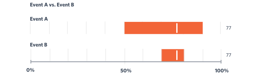
The key features of the boxplot are that it shows the median and the interquartile range (the “middle” 50% of the data). As a result, you can get a decent idea of how the data is spread out. To go back to our earlier example, a wide interquartile range (as seen in Event A) means that opinion on the event was quite polarised, while a “narrow” range (as seen in Event B) means that there was more of a consensus. You might also see or consider using more complicated boxplots that show minimum or maximum values, as well as highlighting outliers.
While boxplots and other charts that show data distribution certainly have their value, it’s worth noting that they’re not necessarily widely understood by the general public – it might be advisable to include an explanation of how to interpret your chart. One of the most important parts of effective data visualisation is to know your audience, and accommodate chart and design choices accordingly.
Culture Counts primarily uses boxplot charts to visualise benchmarks. It is often useful to know where a dimension result sits in comparison to results from other events.
While these are the most common charts you’re likely to see, there are literally hundreds of different ways of visualising your data out there. While it might be tempting to choose some flashy and complicated visuals to spice up a report, try to stick to charts that accurately convey information as simply as possible in a way that is easy for anyone viewing it to understand.
Culture Counts provides evaluation solutions for measuring impact. Are you interested in our data analysis and reporting solutions? Contact the Client Management team for a friendly chat.