Chart Filters
All charts can be filtered by a number of factors to provide more detailed insights into your data.
Filters are available based on the questions you have included in your survey. These filters can be toggled on and off based on your reporting needs and configured charts can be exported individually in PNG format.
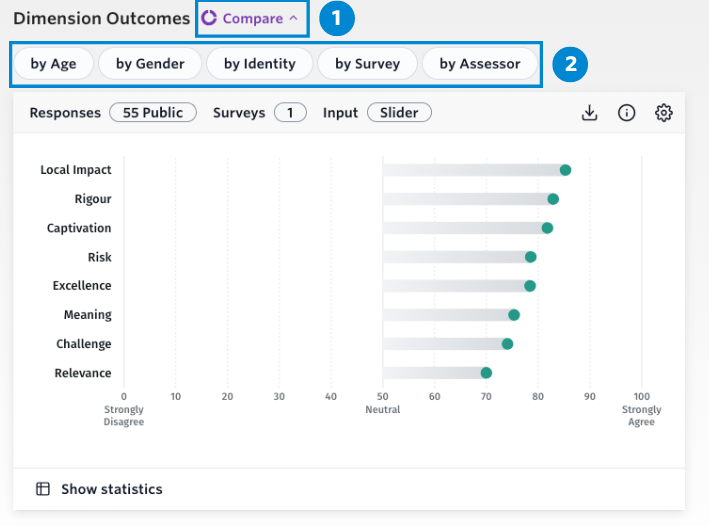
Each chart can be filtered by these five factors:
- By Age – Responses to questions can be broken down by the age group of the respondents
- By Gender – Provides a breakdown of the responses based on the respondent’s gender identity
- By Identity – Breaks down responses by respondent identity. E.G. Born Overseas, LGBTQIA+, Aboriginal and/or Torres Strait Islander (only available in Australia)
- By Survey – Allows the user to compare results collected for each survey
- By Assessor – Allows the user to compare results collected by public, self, and peer assessors
- Sexual Orientation – Results by respondent’s description of sexual orientation (only available in the UK)
- D/deaf or Disability – Results by respondent D/deaf or Disability identity (only available in the UK)
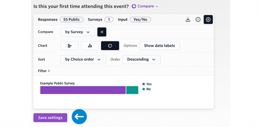
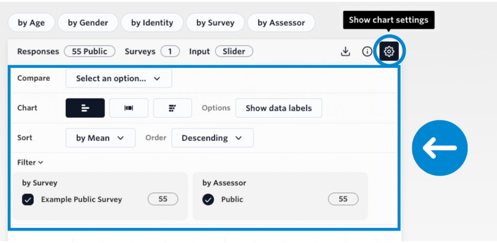
Adjusting your chart settings
Additional filtering options are also available to manipulate the data in ways that suit your needs:
- Compare: a dropdown menu where you can select age, gender, identity and survey or assessor
- Chart: toggle between these to choose the ideal chart configuration and design
- Sort: order the results by mean, dimension name (on the dimension page) and order these results in ascending or descending order
- Filter: select which responses you want to show, either by survey or assessor
You can deselect and reset the chart by clicking on the chosen parameter a second time.
Saving your chart settings
When you have decided on the ideal configuration you can select ‘save settings’ located underneath each chart, to keep the configuration set for the next time you log in. Note that any applied filters will not be saved as this ensures that all available surveys and assessors will be visible on first view.