Introduction to the Analytics Dashboard
The Analytics Dashboard in the Culture Counts Evaluation Platform summarises the results received for an Evaluation or Survey.
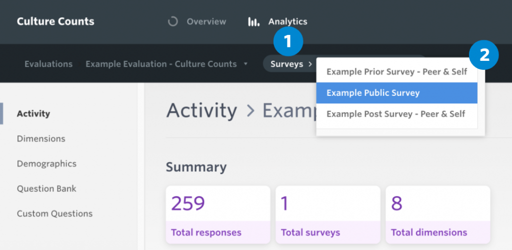
To access this, open the evaluation you wish to look at and click ‘Analytics’ at the top of the screen that sits beside the ‘Overview’ tab.
This will take you to the Analytics Dashboard. From here you can select the evaluation and surveys you wish to look at. The results are shown in real time, so you can visit this section to get a progress update on your surveys, or to download the final results once your surveys have closed.
Results are split into the following sections:
- Activity
- Dimensions
- Demographics
- Question Bank
- Custom Questions
Each question is categorised differently, depending on how you designed your survey. To learn more about each question category, click here. The chart filters feature is applicable to all questions within the analytics dashboard.
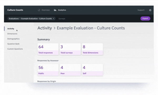
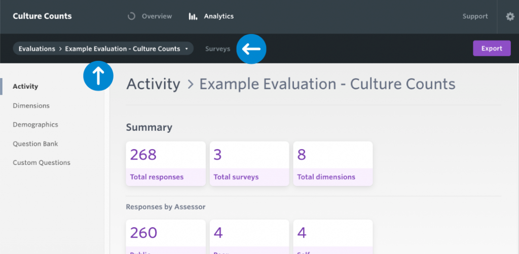
Activity page
The Activity page provides an overview an evaluation.
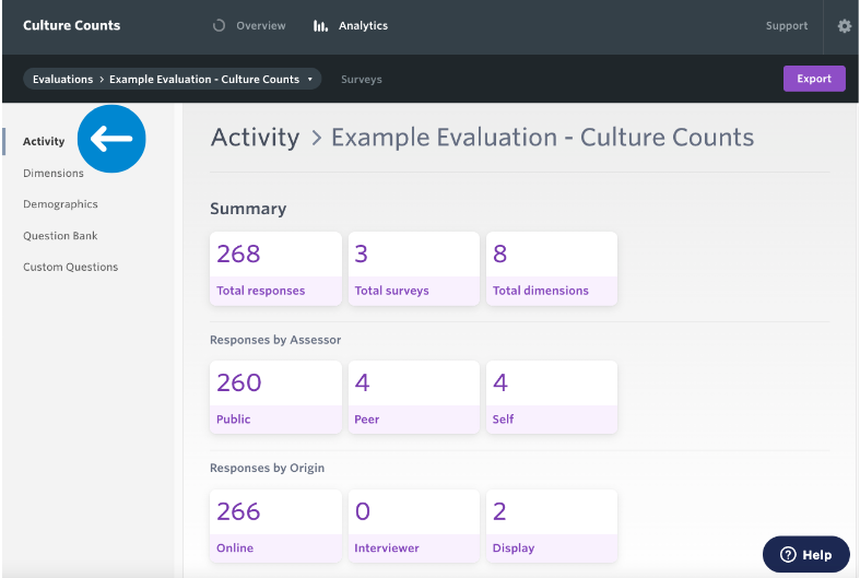
The Summary generates a total response count, provides the number of surveys and the total number of dimensions used within the evaluation.
Responses by Assessor totals are determined by who took the survey. The standard method is public, however you can send a survey to a select group of people (peer & self) using the Invite page on the platform. To read more about peer & self surveys, click here.
Responses by Origin refer to responses collected using the distribution links. These links would have generated based on the methods chosen on the Configure page of the survey builder. To read more about distribution methods, click here. This will update in real time, so it is a great way to keep track of how many responses you are receiving.
You can also view a summary of each individual survey by selecting it from the dropdown labelled Surveys.
Dimensions page
The Dimensions page charts results for all of your selected dimensions. This data can be presented in a number of formats to suit your reporting needs.
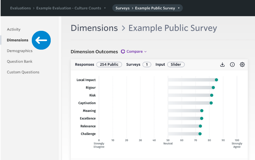
For more information about dimension reporting, click here.
Demographics page
The Demographics page charts results for the gender, age, identity and postcode Question Bank questions in your evaluation or survey.
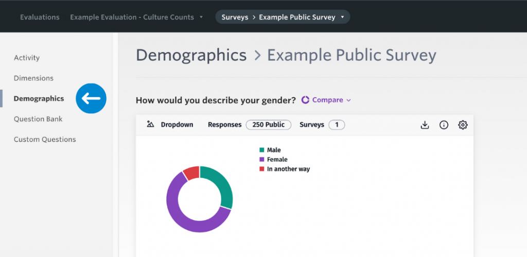
In order to view these results in the Demographics section, the standardised Question Bank ‘Demographic’ questions must be used. Any custom demographics questions will be located in the Custom Questions section.
Each chart summarises the data collected for each question and provides the number of responses and how many surveys it is pulling the data from.
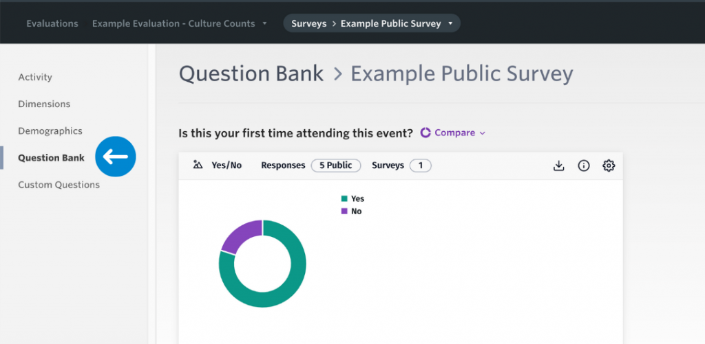
Question Bank page
The Question Bank page charts the responses to any questions you have added from our standardised Question Bank. You can find out more about the Question Bank here.
Custom Questions page
When designing a survey, you are given the option of including custom questions, which can comprise of any question type outside the list of standard dimensions or Question Bank questions.
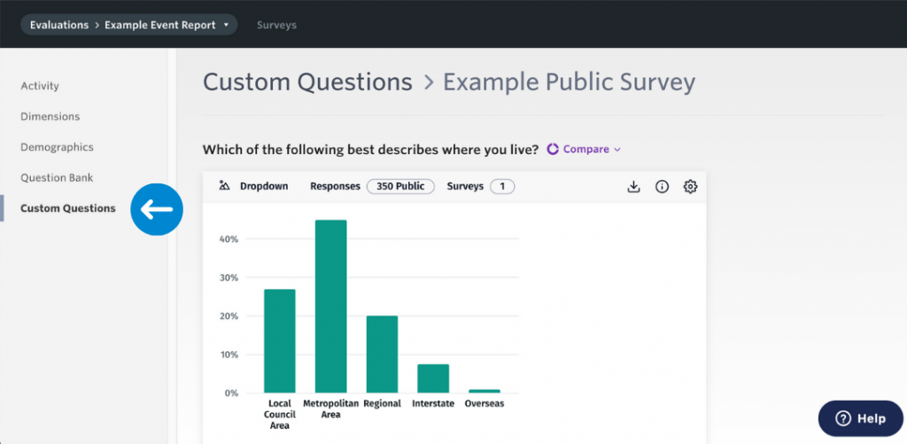
This section of the analytics dashboard charts the results of all custom questions added to your survey with the exception of responses to free text questions. Free text questions appear in the analytics dashboard as full comments, in list form.